

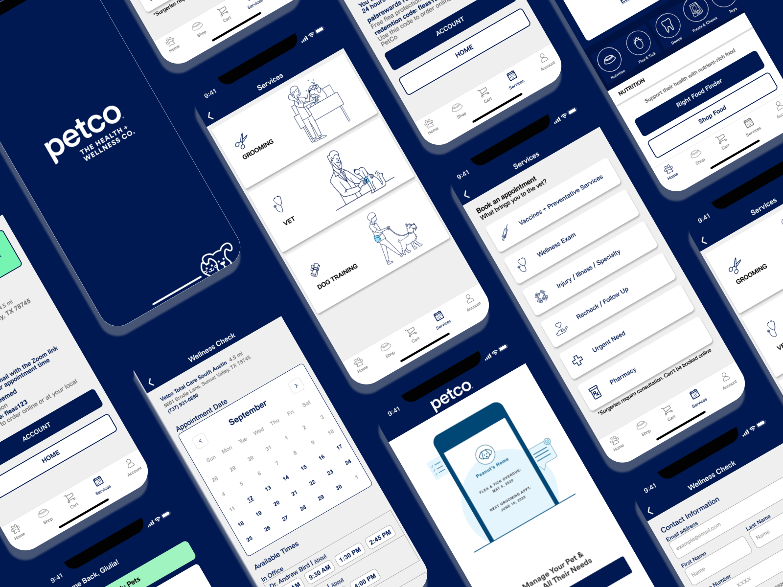
Petco App Redesign
The notional redesign of the Petco application developed by a team of UX designers.
This project was a collaboration of three UX designers to solve the goals of the business and user needs. I worked as the Research Lead in this project.
Overview
Background
Petco is a national pet supply chain store, founded in 1965. Today, they have over 1,500 locations throughout the United States.
"Petco is a category-defining health and wellness company focused on improving the lives of pets, pet parents and our own Petco partners."
Role
Research Lead in a team of 3 UX Designers
Timeline
2 week design sprint
Layout
Mobile Application
Tools
Figma, Figjam, Canva, Goodnotes, Google Suites, Zoom
The Process
Using the Double Diamond thinking methodology, I was able to collaborate with my team on this project.
Select the Circle Below to jump to specified selection.
Discover
The Problem
The group project was assigned to us in which we were given these problems:
Build out the mobile application to aide in the clientele’s use
Aide in the booking of appointments for the Petco veterinarians
Provide a solution to the problems faced due to the effects of COVID-19
User Interviews
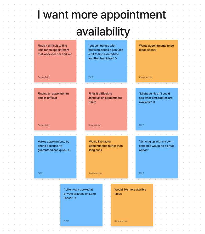
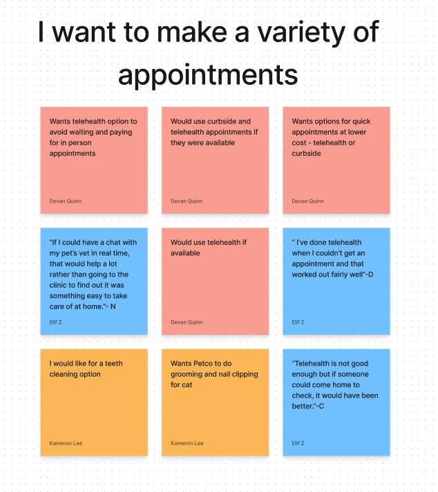
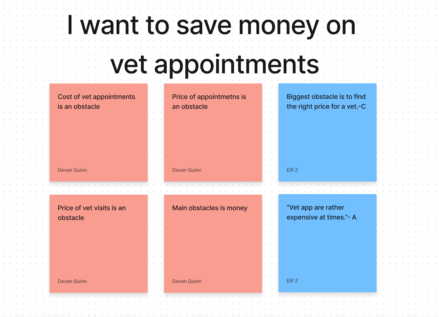
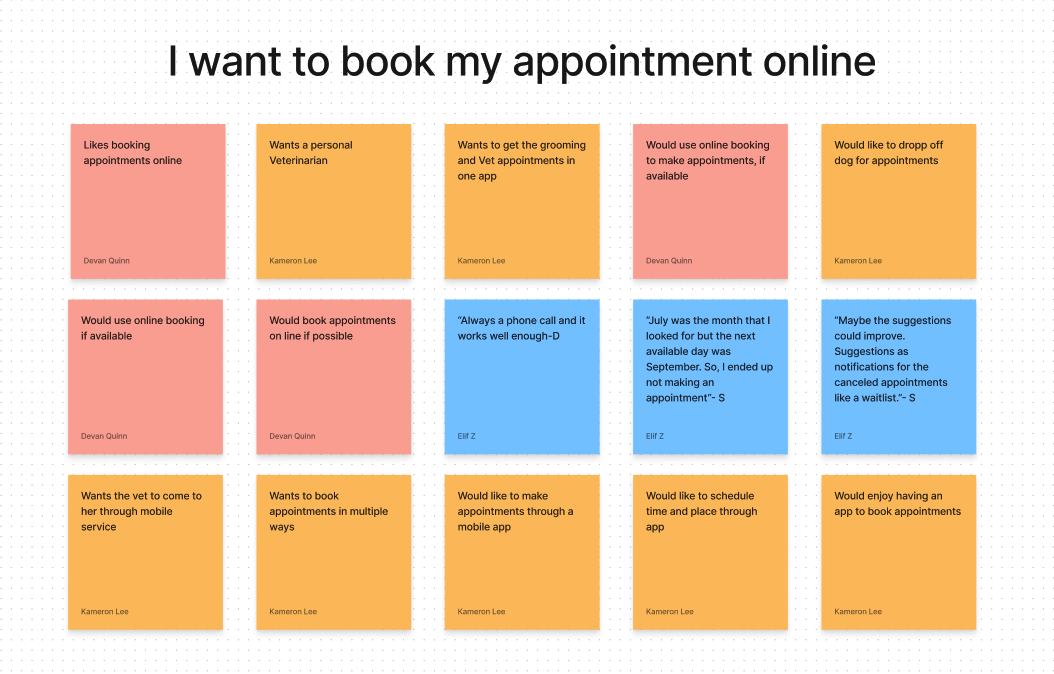
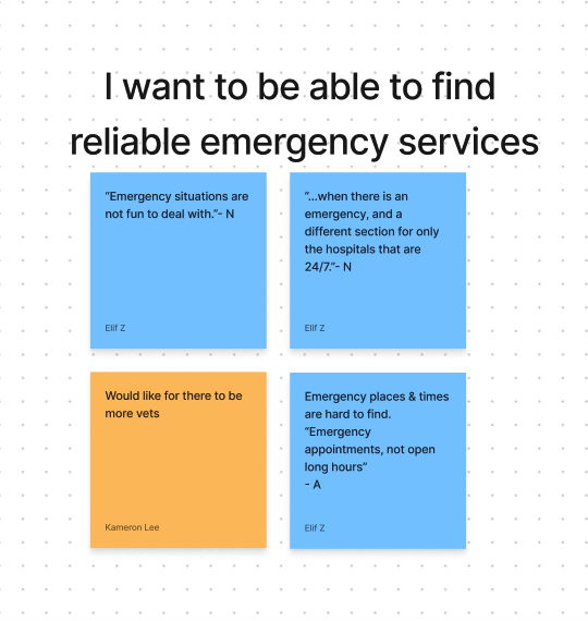
The first step in our discovery, to validate Petco’s problems, was to create a survey. To view the survey click here. After 40+ responses we followed up with interviewing 12 of those individuals. Those interviews helped us create an affinity map to organize the main points.
Key TakeAways
-
![]()
9/12 interviewees want a variety of appointment options
-
![]()
6/12 users want the option for telehealth appointments
-
![]()
6/12 Users express their dismay of veterinarian prices stating it as an obstacle
This was an unsuspected problem that was discovered*
-
![]()
Users need the service of receiving their products from home
-
![]()
Users express their need for booking feature
-
![]()
Users express their want for consistency
-
![]()
Users express their need for information and reviews


Current Application
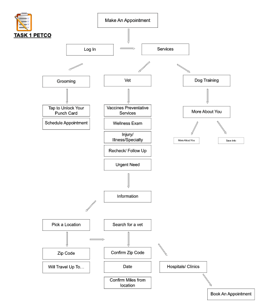
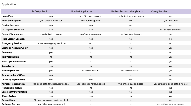
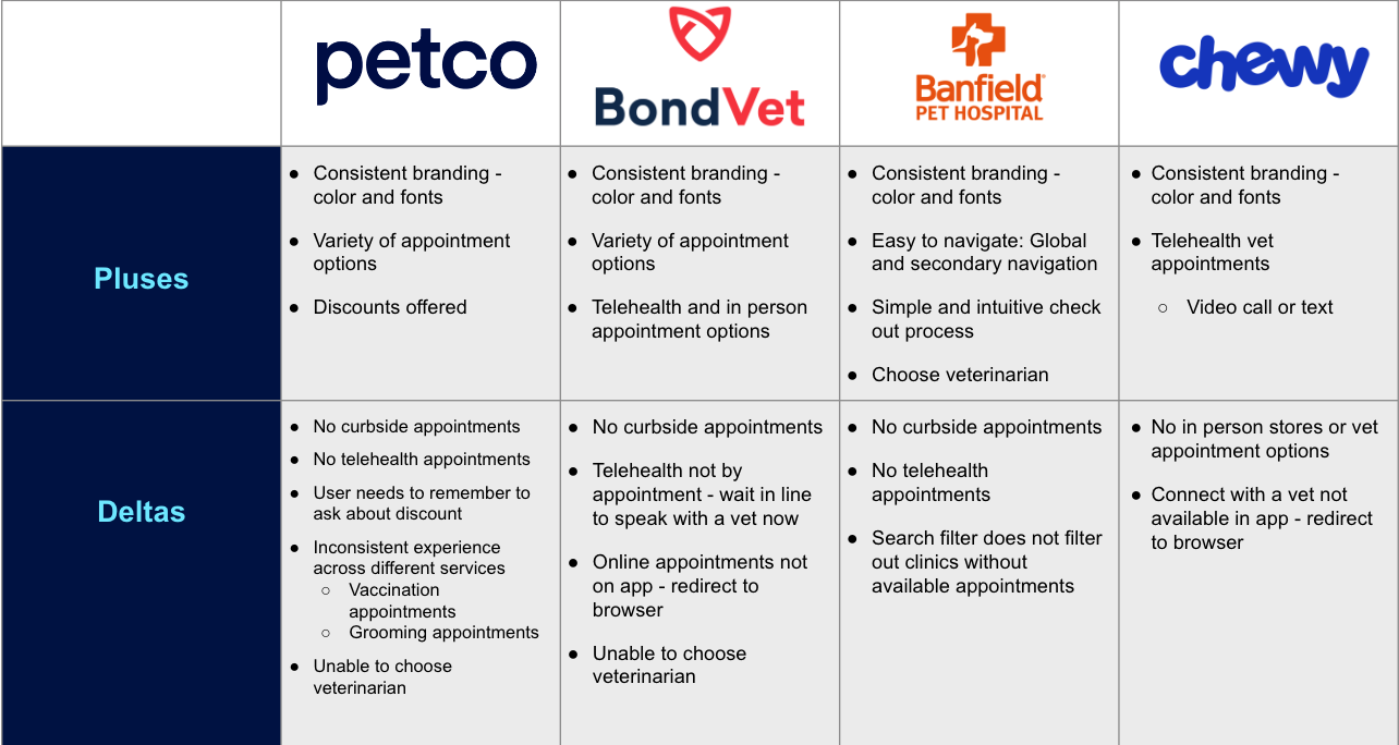
From the heuristic evaluation we created we were able to understand the strengths and areas of improvement for the application. The 3 major pain points we decided to address in our redesign. To view the whole report click here.

Lack of appointment times and types
-
Many areas we tested had week long waits before an appointment was available. Additionally, only in person appointments were available, which doesn't allow for much flexibility in scheduling and requires customers to drive all the way to the PetCo veterinary office, even for quick questions or concerns.

The missing appointment details
-
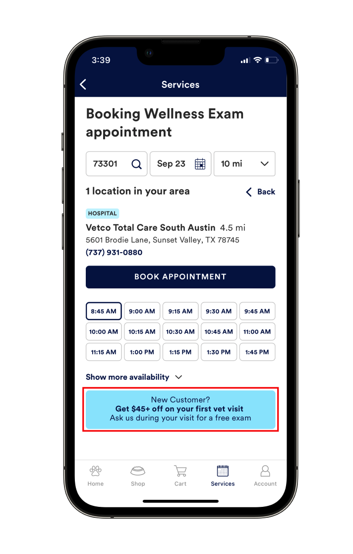
The booking page had two issues. First, users have very limited information when choosing an appointment. Second, they can only view available times, not the veterinarian that they will planned to visit.
Missing money saving opportunities
-
The booking page has a banner advertising a discount for first time customers, which is a good money saving opportunity. However, users must remember to ask for the discount at their appointment, there is no way for them to apply the discount to their appointment from the app. Additionally, it is a one time discount only, with no other opportunity to save money for returning customers.
Define
Persona
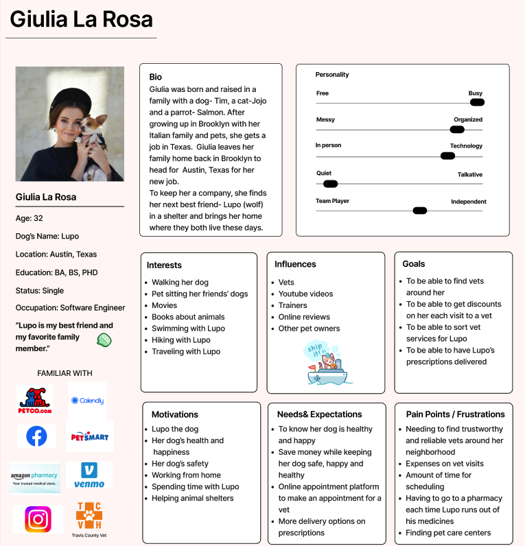
After being able to understand and visualize our user it was time to create a persona that represents the target user. To meet the goals of our audience and the business, we kept the How Might We’s and the Problem Statement cohesive to both the business and the users.
-
Giulia needs to book various veterinary appointments online so that she can find a time that works for their schedule and save money by booking less expensive services.
-
“Help pet owners save money”
“Help users book efficient appointments”
“Help users book online”
“Help users choose their vet”
“Help users choose a date and time that works for them”
“Help users find the right type of appointment”
“Help users contact veterinarians for small concerns”
Design
User Flows
In order for my team to continue we would have to focus on specific tasks essential to our redesign. We found 2 fantastic flows in which we could focus on.
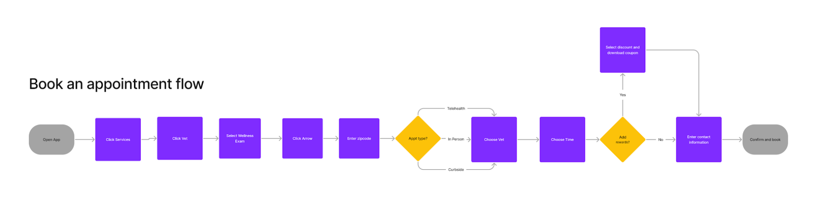
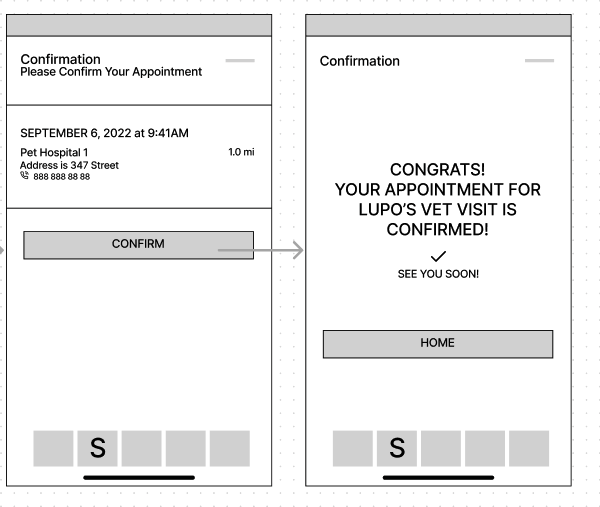
Flow #1 - Book a telehealth appointment
This flow is a straightforward process that will be considered a success when the user properly navigates through the sweater categories and filter their results to help them properly navigate.
Flow #2 - Order a prescription
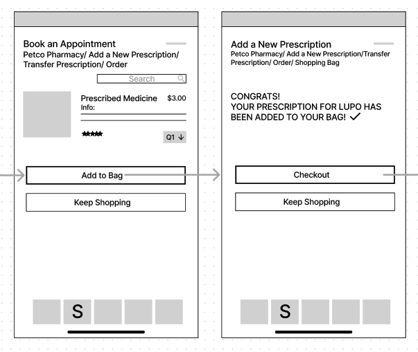
In this flow the user will navigate through the bottom navigation to intuitively order their dogs recommended prescription through the sweater categories.


Prospective User Journey Map
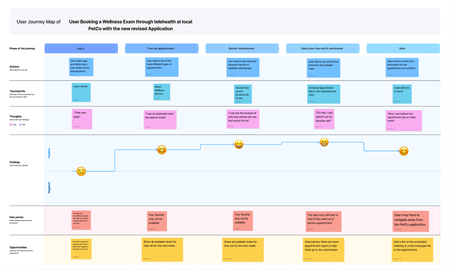
After we had established the persona and the user flows I decided that creating a prospective user map to help the team illustrate the users emotion through the process.
Retrospective User Journey Map
This second journey map illustrates the new and improved Petco application and the users emotional journey when using the app afterwards.
Sketches
After the team had decided on the user flows we all started to sketch out our image for the new redesign of Petco. We wanted to keep certain elements that the application had already created while keeping the intuitiveness that the original application had. We wanted to reward existing customers for using the application while helping to keep the application beginner friendly.


If you would like to view more click here.
Wireframes
The team gave each other lots of feedback and these designs were decided upon and transferred into digital wireframes.

If you would like to view more click here.

Components
The next step was to establish some the components to keep the work cohesive. The library included buttons, hex colors, templates for the iphone, a working calendar, and many other graphic icons to keep the application cohesive. To view the component library click here.
Prototype
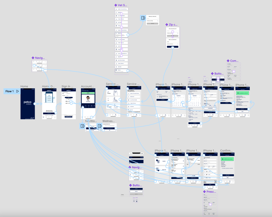
The team then split up and got to work on a different set of screens. We worked together to change the wireframes to a high fidelity design. After all was done we then connected all the screens into the cohesive design.
Deliver
After the prototype was finished we needed to do some testing. We conducted 9 usability tests to discover where we needed to fix pain points.
Key Insights
9 / 9 users were able to complete the vet appointment flow
9 / 9 users were able to complete the reorder prescription flow
3 / 9 users wanted to be able to learn about the vet they chose
5 / 9 users had difficulty reading the confirmation page
5 / 9 users were confused about the white space on the home page
7 / 9 users noted that the design was intuitive
Iteration from Usability Testing

-
Out of the usability test results it was discovered that 5/9 users had difficulty when reading the text displayed. This is due to the coloring, size, and spacing used. We followed WCAG specifications in order to make the text more accessible to the users.

-
In the original prototype many users noted that they would like to see information on their veterinarian. We ended up adding that feature into the application due to 3/9 users mentioning it.

-
In the original design there was an area that was blank in between the bottom navigation and the middle scroll wheel. In order for the banner to appear the user would have to select a category in the middle scroll wheel. It was left undiscovered and marked as confusing by 5/9 users. I came up with a solution by already having a category selected when opening the app. This would prove to be successful and helped with the intuitively of the design.
Solution
After the iterations had been made it was time to present the designs. Click here to view the design on Figma.
Conclusion
Impact
The app now improves upon the original design. The app now helps the user have more accessibility to control over their pet and the treatment they receive, data is now focused better within the app. This serves the business and the users and will help with the veterinary services by implementing rewards, offering customers discounts on services and products. This update allows for convenience for the business and the user.
"The app is much better after this redesign. It feels like a major upgrade."
Next Steps
In being short on time, I would build out the reward section of the app, especially since we received lots of feedback saying so.
Conducting a card sorting would also be beneficial for the Petco app. It was noted by 4 / 9 users that the graphic icons used were not necessarily correlating with the tasks displayed.
There is definitely more research to be done and we received feedback that specific pets need different treatments depending on the species. More research could add to the areas we would need to branch out upon.